Creating an intuitive global navigation menu
Table of contents
Overview
The Challenge
GAF is a roofing manufacturer whose website serves 7 million yearly visitors. Its cluttered mega menu required an overhaul to help users find what they needed. My goal was to make the global menu at the top of the website and intuitive and easy to navigate.
Business impact
By presenting test results, I earned buy-in from reluctant stakeholders to remove unnecessary links and use effective labeling. The result simplified decision-making and improved SEO for the site overall. Measurable results included a 17% increase in clicks on a homeowner-targeted label.
My role
GAF’s global navigation evolved through multiple iterations alongside UI updates to the website. My focus was on structuring the menu to better serve architects, homeowners and buildings owners rather than making visual changes. In a series of updates, I conducted moderated and unmoderated user tests and analytics research to gain stakeholder buy-in.
Understanding user needs
Assumptions about user needs
Business stakeholders wanted all technical documents architects needed to be clearly accessible.
The global navigation could not contain all 22 document links, alongside other menu items. A bloated menu would be difficult to scan and negatively impact SEO. We initially proposed keeping priority links in the global menu and adding an additional documents menu on the homepage.
To test this approach, I prototyped this version of the homepage and conducted interviews with 5 architects.
I created a test script with scenarios that mirrored real project needs for respondents. My goal was to see how easily they would find specific documents.
Learning our assumptions were wrong
Tests showed architects didn’t want every document displayed at once on an extensive supplemental menu. Instead, they wanted a single download containing all documents tied to a building material type. Hunting for each document would be too tedious and time-consuming.
“It’s ten or eleven different places I may need to visit instead of having all of those things attached to that product.”
Cherise L.
Senior Specification Writer
During testing, all users gravitated toward the global navigation menu and assumed by clicking on a roof material link they could eventually download all related documents together. They skipped individual document links.
We concluded we did not need to list out all documents on the website. These findings would later prompt the UX team to explore document bundle downloads.
Stakeholder buy-in gained by competitor insights
In addition to task-based questions, I also asked users how they felt about browsing other manufacturers’ websites. My respondants they complained about competitor brands like Carlisle and Sarnifil which had websites they felt were overbloated with information and poorly organized. This information also helped me refocus stakeholders from wanting to list every document to streamlining the global navigation, to help users access what they needed by category.
Creating intuitive labels
Users were confused by the menu’s labeling
When looking for documents, 3 out of 5 architects clicked on “Plan & Design” first before eventually finding the link they wanted under “Roofing Materials.”
Most links under “Plan & Design” were planning resources for homeowners, but testers interpreted “Design” as architect-focused. They also didn’t know how content under “For Pros” and “Resources” would be different.
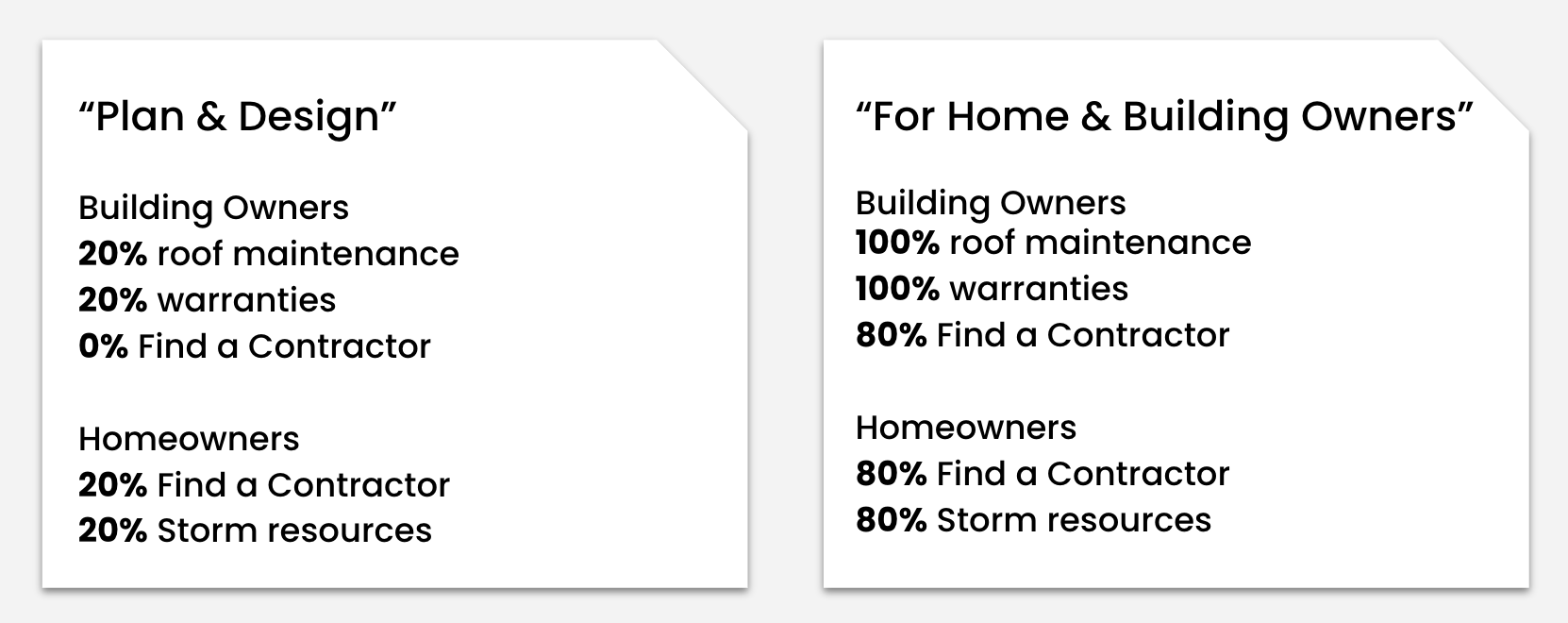
Validating new labels through testing
I proposed using “For Home & Building Owners” which would clearly be for homeowners and building managers. We would also simplify options by removing the “Resources” label. I validated this new set of menu labels through testing.
A user selects a menu item to complete a task
“For Home & Building Owners” tested much better than “Plan & Design,” validating the update.
Organizing menu links
Validating links with analytics
Menu space was limited, so every link needed to prove its value to users. I worked with an SEO specialist to ensure key search terms would be represented. I also used Google Analytics to review existing links and removed the lowest performers. For example, “Advanced Algae Protection” received under 1% of clicks over six months, so it didn’t belong on the menu.
Menu items with the lowest clicks
Final design
A simplified primary navigation
After testing and relabeling, there are 5 links in the primary navigation instead of 6. Labeling is clearer and there’s less room for confusion. Six months of analytics data post update showed “For Home & Building Owners” received 17% more clicks than “Plan & Design.”
Before
After
Sub-menus with useful links only
GAF’s business stakeholders were initially reluctant to give up an abundance of links on submenus as the website went through maturity updates. Now, the menu is streamlined and easy to scan.
Before
After
Creating an intuitive global navigation menu
Table of contents
Overview
The Challenge
GAF is a roofing manufacturer whose website serves 7 million yearly visitors. Its cluttered mega menu required an overhaul to help users find what they needed. My goal was to make the global menu at the top of the website and intuitive and easy to navigate.
Business impact
By presenting test results, I earned buy-in from reluctant stakeholders to remove unnecessary links and use effective labeling. The result simplified decision-making and improved SEO for the site overall. Measurable results included a 17% increase in clicks on a homeowner-targeted label.
My role
GAF’s global navigation evolved through multiple iterations alongside UI updates to the website. My focus was on structuring the menu to better serve architects, homeowners and buildings owners rather than making visual changes. In a series of updates, I conducted moderated and unmoderated user tests and analytics research to gain stakeholder buy-in.
Understanding user needs
Assumptions about user needs
Business stakeholders wanted all technical documents architects needed to be clearly accessible.
The global navigation could not contain all 22 document links, alongside other menu items. A bloated menu would be difficult to scan and negatively impact SEO. We initially proposed keeping priority links in the global menu and adding an additional documents menu on the homepage.
To test this approach, I prototyped this version of the homepage and conducted interviews with 5 architects.
I created a test script with scenarios that mirrored real project needs for respondents. My goal was to see how easily they would find specific documents.
Learning our assumptions were wrong
Tests showed architects didn’t want every document displayed at once on an extensive supplemental menu. Instead, they wanted a single download containing all documents tied to a building material type. Hunting for each document would be too tedious and time-consuming.
“It’s ten or eleven different places I may need to visit instead of having all of those things attached to that product.”
Cherise L.
Senior Specification Writer
During testing, all users gravitated toward the global navigation menu and assumed by clicking on a roof material link they could eventually download all related documents together. They skipped individual document links.
We concluded we did not need to list out all documents on the website. These findings would later prompt the UX team to explore document bundle downloads.
Stakeholder buy-in gained by competitor insights
In addition to task-based questions, I also asked users how they felt about browsing other manufacturers’ websites. My respondants they complained about competitor brands like Carlisle and Sarnifil which had websites they felt were overbloated with information and poorly organized. This information also helped me refocus stakeholders from wanting to list every document to streamlining the global navigation, to help users access what they needed by category.
Creating intuitive labels
Users were confused by the menu’s labeling
When looking for documents, 3 out of 5 respondents clicked on “Plan & Design” first before eventually finding the link they wanted under “Roofing Materials.”
Most links under “Plan & Design” were planning resources for homeowners, but testers interpreted “Design” as architect-focused. They also didn’t know how content under “For Pros” and “Resources” would be different.
Validating new labels through testing
I proposed using “For Home & Building Owners” which would clearly be for homeowners and building managers. We would also simplify options by removing the “Resources” label. I validated this new set of menu labels through testing.
A user selects a menu item to complete a task
“For Home & Building Owners” tested much better than “Plan & Design,” validating the update.
Organizing menu links
Validating links with analytics
Menu space was limited, so every link needed to prove its value to users. I worked with an SEO specialist to ensure key search terms would be represented. I also used Google Analytics to review existing links and removed the lowest performers. For example, “Advanced Algae Protection” received under 1% of clicks over six months, so it didn’t belong on the menu.
Menu items with the lowest clicks
Final design
A simplified primary navigation
After testing and relabeling, there are 5 links in the primary navigation instead of 6. Labeling is clearer and there’s less room for confusion. Six months of analytics data post update showed “For Home & Building Owners” received 17% more clicks than “Plan & Design.”
Before
After
Sub-menus with useful links only
GAF’s business stakeholders were initially reluctant to give up an abundance of links on submenus as the website went through maturity updates. Now, the menu is streamlined and easy to scan.
Before
After
Table of contents
Creating an intuitive global navigation menu
Overview
The Challenge
GAF is a roofing manufacturer whose website serves 7 million yearly visitors. Its cluttered mega menu required an overhaul to help users find what they needed. My goal was to make the global menu at the top of the website and intuitive and easy to navigate.
Business impact
By presenting test results, I earned buy-in from reluctant stakeholders to remove unnecessary links and use effective labeling. The result simplified decision-making and improved SEO for the site overall. Measurable results included a 17% increase in clicks on a homeowner-targeted label.
My role
GAF’s global navigation evolved through multiple iterations alongside UI updates to the website. My focus was on structuring the menu to better serve architects, homeowners and buildings owners rather than making visual changes. In a series of updates, I conducted moderated and unmoderated user tests and analytics research to gain stakeholder buy-in.
Understanding user needs
Assumptions about user needs
Business stakeholders wanted all technical documents architects needed to be clearly accessible.
The global navigation could not contain all 22 document links, alongside other menu items. A bloated menu would be difficult to scan and negatively impact SEO. We initially proposed keeping priority links in the global menu and adding an additional documents menu on the homepage.
To test this approach, I prototyped this version of the homepage and conducted interviews with 5 architects.
I created a test script with scenarios that mirrored real project needs for respondents. My goal was to see how easily they would find specific documents.
Learning our assumptions were wrong
Tests showed architects didn’t want every document displayed at once on an extensive supplemental menu. Instead, they wanted a single download containing all documents tied to a building material type. Hunting for each document would be too tedious and time-consuming.
“It’s ten or eleven different places I may need to visit instead of having all of those things attached to that product.”
Cherise L.
Senior Specification Writer
During testing, all users gravitated toward the global navigation menu and assumed by clicking on a roof material link they could eventually download all related documents together. They skipped individual document links.
We concluded we did not need to list out all documents on the website. These findings would later prompt the UX team to explore document bundle downloads.
Stakeholder buy-in gained by competitor insights
In addition to task-based questions, I also asked users how they felt about browsing other manufacturers’ websites. Respondents complained about competitor websites being poorly organized with too much information. This feedback helped stakeholders prioritize a streamlined, intuitive global navigation.
Creating intuitive labels
Users were confused by the menu’s labeling
When looking for documents, 3 out of 5 architects clicked on “Plan & Design” first before eventually finding the link they wanted under “Roofing Materials.”
Most links under “Plan & Design” were planning resources for homeowners, but testers interpreted “Design” as architect-focused. They also didn’t know how content under “For Pros” and “Resources” would be different.
Validating new labels through testing
I proposed using “For Home & Building Owners” which would clearly be for homeowners and building managers. We would also simplify options by removing the “Resources” label. I validated this new set of menu labels through testing.
A user selects a menu item to complete a task
“For Home & Building Owners” tested much better than “Plan & Design,” validating the update.
Organizing menu links
Validating links with analytics
Menu space was limited, so every link needed to prove its value to users. I worked with an SEO specialist to ensure key search terms would be represented. I also used Google Analytics to review existing links and removed the lowest performers. For example, “Advanced Algae Protection” received under 1% of clicks over six months, so it didn’t belong on the menu.
Menu items with the lowest clicks
Final design
A simplified primary navigation
After testing and relabeling, there are 5 links in the primary navigation instead of 6. Labeling is clearer and there’s less room for confusion. Six months of analytics data post update showed “For Home & Building Owners” received 17% more clicks than “Plan & Design.”
Before
After
Sub-menus with useful links only
GAF’s business stakeholders were initially reluctant to give up an abundance of links on submenus as the website went through maturity updates. Now, the menu is streamlined and easy to scan.
Before
After