Defeating buyer’s remorse with KIT
Table of contents
Overview
The challenge
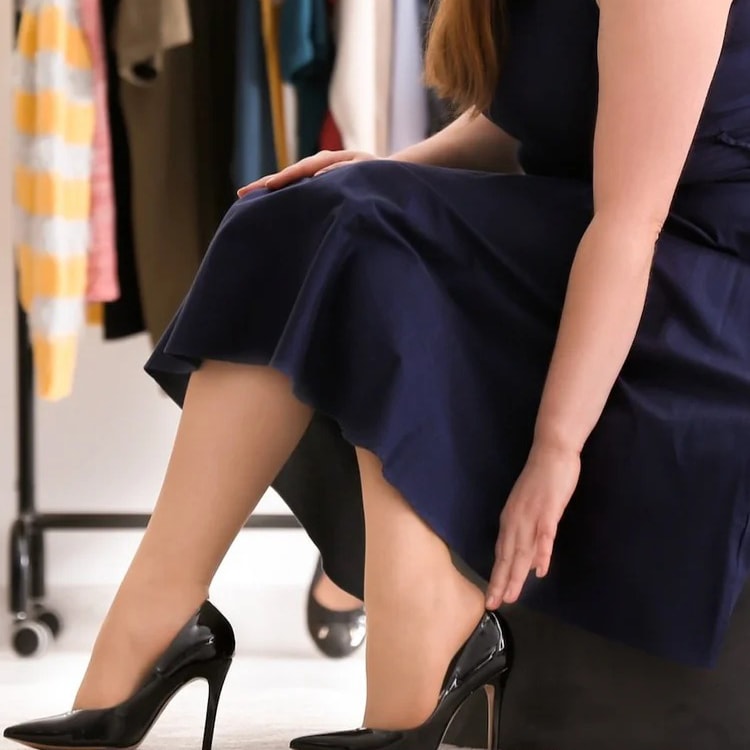
Clothes purchased online have an estimated 20-40% return rate. This rate represents a disappointing shopping experience for customers and expensive returns for retailers. I set out to help online shoppers choose clothes they’ll actually wear, reducing regret and returns.
The solution
I designed a shopping platform that would enable shoppers to know how a style might look in an outfit before making a purchase. Helping shoppers get the most value out of potential purchases could massively reduce returns and help retailers reduce logistical costs.
My role
I was the sole UX researcher and designer of KIT, which I conceptualized as my capstone project while completing my UX certification at Springboard. KIT was an opportunity for me to combine my professional history in fashion design with my UX knowledge.
Research
I wanted to understand how purchases could become unsuccessful by interviewing shoppers. I screened 19 volunteers, looking for respondents who returned clothes within the previous month so experiences would be fresh in mind.
I settled on 6 respondents to interview.

Tiana, S.
Marketer, 31

Yishan S.
Architect, 26

Mindy U.
Influencer, 30
Robin J.
Handbag Designer, 37

Svetlana Y.
Stay-At-Home Mom, 41

Olivia B
Product Manager, 35
“Can you walk me through the last time you returned something?”
Insights
I had assumed using shopping as entertainment led to over-purchasing and returns. But my most of my interviewees were mindful decisions-makers, despite varying levels of spending power. They spent hours researching prices, fit and styles before making a purchase.
Key pain points
- Comparison shopping between different brands can be tedious
- A plethora of retailer options overwhelms shoppers
- It can be hard to know if something will “work out” style or fit-wise online
Existing services weren’t enough
A user shopping on Google needed to have specific brands in mind or would be overwhelmed by the number of search results for a generic term like “Cropped sweater.” Recommendations from curation services like Lyst and Shopstyle did not display price comparisons from different retailers.
I believed I needed to design a solution that would offer both price comparisons and personalized curation.
“I don’t trust that would give me the best price. I would do my own research.”
Tiana S.
PR Consultant, 31
Personas
My interview insights helped me create four broad archetypes to design for. Reflective of my interviewees, these personas varied widely in patience, time, and budget.

Busy Essie
“I need clothes for an event but don’t have much time to shop.”

Deal-Hunter Dee
“I’ll check out a sale.”

Weary Sophie
“I only know 3 brands that look good on me and fit my budget.”
Defining the MVP
In addition to offering curation and price comparisons, I wanted to further differentiate the platform by showing shoppers how a potential purchase would work stylistically before they buy.
Inspired by closet-organization apps like Purple, which visualize how owned items pair with retail and social content, I designed an outfit-builder feature. It would help my budget-minded persona, “Weary Sophie,” verify that a new purchase would work with pieces she already owned.
Inspiration from the Purple app
I created a clickable prototype in Marvel and gorilla-tested it on 5 users to check proof-of-concept. Testers found the shopping steps to be straightforward, but ⅗ testers didn’t immediately understand the concept of a virtual closet.
This showed me the concept of an outfit-maker needed to be self-explanatory and not distract from the shopping experience. With this insight in mind, I sketched wireframes of essential flows.
Test and design
Adding real product photos and color to my wireframes brought them to life, and I conducted remote or in-person tests on female respondents aged 27-41. All participants had purchased clothing on their phones within the past month, making them the right customer base. I asked them to walk through three essential flows.
Shopping flow
In Version 1, I paired search results with a pre-made outfit so users could see how blouses might look styled. Testers found this confusing—scrolling next to a saved outfit felt distracting rather than helpful.
Version 2 removed the side-by-side layout, allowing users to browse uninterrupted. But because testers did respond well to the idea of shopping with an outfit in mind, I reintroduced it as an optional action. Now users could view an item styled within an outfit by tapping a button on the product page.
Outfit creation flow
Version 1 of KIT’s outfit-maker was heavily influenced by virtual closet apps, but testers found the drag-and-drop collage format cumbersome.
Version 2 clearly showed how items could be added to an outfit. Per user feedback, a completed outfit would show users the total cost of all items combined and provide a bulk check-out option.
Item addition flow
To help users see if a purchase could be styled with what they already owned, I added a virtual closet to KIT for saving personal photos. In Version 1, users found the saving process overly complex and didn’t want to enter detailed information just to save a photo.
The final design simplified this flow, allowing users to save photos quickly without selecting attributes like color or season.
Final flows
In its final iteration, KIT lets personas like Stylish Sara experiment with styling before buying, while Busy Essie can quickly find a specific item and feel confident she’s getting the best price.
Restrospective
KIT was an early project for me, and looking back as a more experienced UX designer, there are clear changes I would make. For an MVP, the scope should have been narrower and more focused. Enabling bulk purchases across multiple retailers would have been ambitious yet valuable on its own. Features like the virtual closet would be better explored in later stages of a more mature product. If I could redo this project, I would significantly limit the initial scope.
Defeating buyer’s remorse with KIT
Table of contents
Overview
The challenge
Clothes purchased online have an estimated 20-40% return rate. This rate represents a disappointing shopping experience for customers and expensive returns for retailers. I set out to help online shoppers choose clothes they’ll actually wear, reducing regret and returns.
The solution
I designed a shopping platform that would enable shoppers to know how a style might look in an outfit before making a purchase. Helping shoppers get the most value out of potential purchases could massively reduce returns and help retailers reduce logistical costs.
My role
I was the sole UX researcher and designer of KIT, which I conceptualized as my capstone project while completing my UX certification at Springboard. KIT was an opportunity for me to combine my professional history in fashion design with my UX knowledge.
Research
I wanted to understand how purchases could become unsuccessful by interviewing shoppers. I screened 19 volunteers, looking for respondents who returned clothes within the previous month so experiences would be fresh in mind.
I settled on 6 respondents to interview.
Tiana, S.
Marketer, 31
Yishan S.
Architect, 26
Mindy U.
Influencer, 30
Robin J.
Handbag Designer, 37
Svetlana Y.
Stay-At-Home Mom, 41
Olivia B
Product Manager, 35
“Can you walk me through the last time you returned something?”
Insights
I had assumed using shopping as entertainment led to over-purchasing and returns. But my most of my interviewees were mindful decisions-makers, despite varying levels of spending power. They spent hours researching prices, fit and styles before making a purchase.
Key pain points
- Comparison shopping between different brands can be tedious
- A plethora of retailer options overwhelms shoppers
- It can be hard to know if something will “work out” style or fit-wise online
Existing services weren’t enough
A user shopping on Google needed to have specific brands in mind or would be overwhelmed by the number of search results for a generic term like “Cropped sweater.” Recommendations from curation services like Lyst and Shopstyle did not display price comparisons from different retailers.
I believed I needed to design a solution that would offer both price comparisons and personalized curation.
“I don’t trust that would give me the best price. I would do my own research.”
Tiana S.
PR Consultant, 31
Personas
My interview insights helped me create four broad archetypes to design for. Reflective of my interviewees, these personas varied widely in patience, time, and budget.
Busy Essie
“I need clothes for an event but don’t have much time to shop.”
Deal-Hunter Dee
“I’ll check out a sale.”
Weary Sophie
“I only know 3 brands that look good on me and fit my budget.”
Defining the MVP
In addition to offering curation and price comparisons, I wanted to further differentiate the platform by showing shoppers how a potential purchase would work stylistically before they buy.
Inspired by closet-organization apps like Purple, which visualize how owned items pair with retail and social content, I designed an outfit-builder feature. It would help my budget-minded persona, “Weary Sophie,” verify that a new purchase would work with pieces she already owned.
Inspiration from the Purple app
I created a clickable prototype in Marvel and gorilla-tested it on 5 users to check proof-of-concept. Testers found the shopping steps to be straightforward, but ⅗ testers didn’t immediately understand the concept of a virtual closet.
This showed me the concept of an outfit-maker needed to be self-explanatory and not distract from the shopping experience. With this insight in mind, I sketched wireframes of essential flows.
Test and design
Adding real product photos and color to my wireframes brought them to life, and I conducted remote or in-person tests on female respondents aged 27-41. All participants had purchased clothing on their phones within the past month, making them the right customer base. I asked them to walk through three essential flows.
Shopping flow
In Version 1, I paired search results with a pre-made outfit so users could see how blouses might look styled. Testers found this confusing—scrolling next to a saved outfit felt distracting rather than helpful.
Version 2 removed the side-by-side layout, allowing users to browse uninterrupted. But because testers did respond well to the idea of shopping with an outfit in mind, I reintroduced it as an optional action. Now users could view an item styled within an outfit by tapping a button on the product page.
Outfit creation flow
Version 1 of KIT’s outfit-maker was heavily influenced by virtual closet apps, but testers found the drag-and-drop collage format cumbersome.
Version 2 clearly showed how items could be added to an outfit. Per user feedback, a completed outfit would show users the total cost of all items combined and provide a bulk check-out option.
Item addition flow
To help users see if a purchase could be styled with what they already owned, I added a virtual closet to KIT for saving personal photos. In Version 1, users found the saving process overly complex and didn’t want to enter detailed information just to save a photo.
The final design simplified this flow, allowing users to save photos quickly without selecting attributes like color or season.
Final flows
In its final iteration, KIT lets personas like Stylish Sara experiment with styling before buying, while Busy Essie can quickly find a specific item and feel confident she’s getting the best price.
Restrospective
KIT was an early project for me, and looking back as a more experienced UX designer, there are clear changes I would make. For an MVP, the scope should have been narrower and more focused. Enabling bulk purchases across multiple retailers would have been ambitious yet valuable on its own. Features like the virtual closet would be better explored in later stages of a more mature product. If I could redo this project, I would significantly limit the initial scope.
Table of contents
Defeating buyer’s remorse with KIT
Overview
The challenge
Clothes purchased online have an estimated 20-40% return rate. This rate represents a disappointing shopping experience for customers and expensive returns for retailers. I set out to help online shoppers choose clothes they’ll actually wear, reducing regret and returns.
The solution
I designed a shopping platform that would enable shoppers to know how a style might look in an outfit before making a purchase. Helping shoppers get the most value out of potential purchases could massively reduce returns and help retailers reduce logistical costs.
My role
I was the sole UX researcher and designer of KIT, which I conceptualized as my capstone project while completing my UX certification at Springboard. KIT was an opportunity for me to combine my professional history in fashion design with my UX knowledge.
Research
I wanted to understand how purchases could become unsuccessful by interviewing shoppers. I screened 19 volunteers, looking for respondents who returned clothes within the previous month so experiences would be fresh in mind.
I settled on 6 respondents to interview.
Tiana, S.
Marketer, 31
Yishan S.
Architect, 26
Mindy U.
Influencer, 30
Robin J.
Handbag Designer, 37
Svetlana Y.
Stay-At-Home Mom, 41
Olivia B
Product Manager, 35
“Can you walk me through the last time you returned something?”
Insights
I had assumed using shopping as entertainment led to over-purchasing and returns. But my most of my interviewees were mindful decisions-makers, despite varying levels of spending power. They spent hours researching prices, fit and styles before making a purchase.
Key pain points
- Comparison shopping between different brands can be tedious
- A plethora of retailer options overwhelms shoppers
- It can be hard to know if something will “work out” style or fit-wise online
Existing services weren’t enough
A user shopping on Google needed to have specific brands in mind or would be overwhelmed by the number of search results for a generic term like “Cropped sweater.” Recommendations from curation services like Lyst and Shopstyle did not display price comparisons from different retailers.
I believed I needed to design a solution that would offer both price comparisons and personalized curation.
“I don’t trust that would give me the best price. I would do my own research.”
Tiana S.
PR Consultant, 31
Personas
My interview insights helped me create four broad archetypes to design for. Reflective of my interviewees, these personas varied widely in patience, time, and budget.
Busy Essie
“I need clothes for an event but don’t have much time to shop.”
Deal-Hunter Dee
“I’ll check out a sale.”
Weary Sophie
“I only know 3 brands that look good on me and fit my budget.”
Defining the MVP
In addition to offering curation and price comparisons, I wanted to further differentiate the platform by showing shoppers how a potential purchase would work stylistically before they buy.
Inspired by closet-organization apps like Purple, which visualize how owned items pair with retail and social content, I designed an outfit-builder feature. It would help my budget-minded persona, “Weary Sophie,” verify that a new purchase would work with pieces she already owned.
Inspiration from the Purple app
I created a clickable prototype in Marvel and gorilla-tested it on 5 users to check proof-of-concept. Testers found the shopping steps to be straightforward, but ⅗ testers didn’t immediately understand the concept of a virtual closet.
This showed me the concept of an outfit-maker needed to be self-explanatory and not distract from the shopping experience. With this insight in mind, I sketched wireframes of essential flows.
Test and design
Adding real product photos and color to my wireframes brought them to life, and I conducted remote or in-person tests on female respondents aged 27-41. All participants had purchased clothing on their phones within the past month, making them the right customer base. I asked them to walk through three essential flows.
Shopping flow
In Version 1, I paired search results with a pre-made outfit so users could see how blouses might look styled. Testers found this confusing—scrolling next to a saved outfit felt distracting rather than helpful.
Version 2 removed the side-by-side layout, allowing users to browse uninterrupted. But because testers did respond well to the idea of shopping with an outfit in mind, I reintroduced it as an optional action. Now users could view an item styled within an outfit by tapping a button on the product page.
Outfit creation flow
Version 1 of KIT’s outfit-maker was heavily influenced by virtual closet apps, but testers found the drag-and-drop collage format cumbersome.
Version 2 clearly showed how items could be added to an outfit. Per user feedback, a completed outfit would show users the total cost of all items combined and provide a bulk check-out option.
Item addition flow
To help users see if a purchase could be styled with what they already owned, I added a virtual closet to KIT for saving personal photos. In Version 1, users found the saving process overly complex and didn’t want to enter detailed information just to save a photo.
The final design simplified this flow, allowing users to save photos quickly without selecting attributes like color or season.
Final flows
In its final iteration, KIT lets personas like Stylish Sara experiment with styling before buying, while Busy Essie can quickly find a specific item and feel confident she’s getting the best price.
Restrospective
KIT was an early project for me, and looking back as a more experienced UX designer, there are clear changes I would make. For an MVP, the scope should have been narrower and more focused. Enabling bulk purchases across multiple retailers would have been ambitious yet valuable on its own. Features like the virtual closet would be better explored in later stages of a more mature product. If I could redo this project, I would significantly limit the initial scope.